Motivation Behind the UX Strategy
Applications like Amazon and Uber spend millions on making their applications as intuitive and easy-to-use as possible. The recent documentary on Netflix shared light on how e-commerce websites are designing UI/UX in such a way that it tempts the users to spend more time or money on their websites. In this article, I'll talk about Don Norman’s Principles of Interaction Design and Nielsen’s Usability Heuristics, and how they can be applied on Uber to make it better for the end-users.
Prototype Design Changes
There are multiple articles on Nielsen’s Usability Heuristics and Don Norman’s Principles of Interaction Design. I'll spare you the details and dive right into the prototype changes. I've based my proposals on the principles of Visibility, Mapping, Constraints and Naturalness and Feedback.
Nielsen’s Usability Heuristics: Visibility of system status, recognition rather than recall, and flexibility and efficiency of use guided the design of clear interfaces, proactive notifications, and tailored preferences.
Don Norman’s Principles: Visibility, feedback, and natural mapping ensured that the solutions are intuitive, transparent, and easy to use.
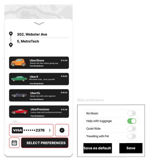
Transparent fare breakdown
Current Scenario: The fare breakdown is technically available, but it’s hidden within the flow of choosing a ride type. The user must first select a particular ride option (e.g., UberX, Comfort, etc.) to view detailed pricing.
The icon to see this breakdown isn’t prominently highlighted; it’s small and doesn’t immediately convey that tapping it will reveal critical pricing details. Users don’t realize they can get a fare breakdown because there are no recognizable labels prompting them to explore this feature.
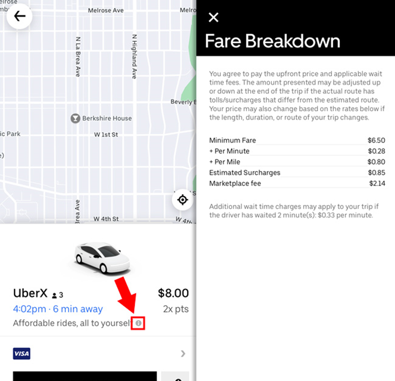
The fix
Immediate Visibility: The “Fare Breakdown” label is placed within each ride card, making it instantly discoverable. Instead of a small icon, users now see a clearly identifiable link that presents breakdown.
One-Tap Access to Details: When the user taps “Fare Breakdown,” a simple, focused overlay appears on top of the current screen. This overlay highlights key components of the fare.

High-Visibility Emergency Button
Current Scenario: The safety toolkit menu button is small and not highlighted when a ride starts.
Also, emergency features are hidden within menus or not immediately obvious. The user needs 2-3 taps to make an emergency call. In an urgent or stressful situation, users struggle to find the help button quickly.
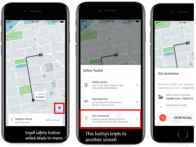
The fix
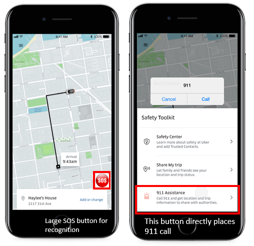
Permanently place an “Emergency” or “SOS” icon in the main trip view. Use bold colors (red) and clear labeling to stand out.
One-tap opens a dedicated safety screen with clear options: call authorities, share location, etc.
Now, tapping on 911 Assistance directly places a call and doesn’t lead to another screen leading to faster response in emergencies.
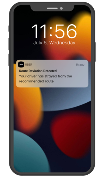
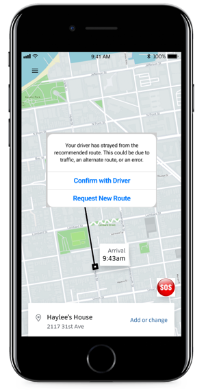
Proactive Anomaly Detection & Guided Recovery
Current Scenario: If the driver deviates from the planned route, the user might only notice after checking the map or when the ETA suddenly changes.
Users often feel anxious and uncertain when unexpected issues arise during a trip—such as a driver deviating from the set route, an unannounced detour, or a sudden cancellation.
Without immediate feedback or guidance, riders must figure out the next steps on their own, leading to frustration and eroded trust in the service.
The fix
Implement a system that continuously monitors ride conditions. If a sudden change or anomaly occurs—like a route deviation or a driver cancellation—the app immediately alerts the user via a clear pop-up or notification.
Alongside the alert, it provides actionable next steps (e.g., “Confirm change with driver,” “Request a new ride,) right on the main screen. By presenting predefined solutions and guidance, the app ensures users can quickly understand the problem and resolve it, restoring confidence and control.
 |  |
Personalized Ride Preferences for Better Experience
Current Scenario: Ride preferences such as "Quiet Ride" or "Help with Luggage" are either unavailable or inconsistently implemented. If available, users often discover these options after booking the ride, requiring them to either manually communicate their preferences to the driver or settle for an experience that doesn't align with their needs.
Drivers may not be informed of the rider's preferences, leading to an unsatisfactory experience (e.g., loud music or lack of luggage assistance when required).
The fix
Ride Preferences Section in Booking Panel: Add a dedicated "Ride Preferences" section within the Pre-Ride Customization & Confirmation Panel before the user confirms their booking.
Default Preference Settings: Include an option to “Save as Default” within the panel so frequent riders don’t have to toggle preferences repeatedly.
Thank you for reading, my figma design for the prototype.